
The current global emergency due to the spread of the coronavirus in several countries shows how fragile our society’s equilibrium is when faced with ‘interior’ threats such as an epidemic. Treatments to relieve symptoms and a vaccine will eventually be found, but in the meantime humankind seems to be helpless against the virus. The only effective weapon available to us is stopping direct contact between people, in order to segregate the infected from the healthy.
In a sense this is a blow to humankind’s self esteem: didn’t we go to the Moon, don’t we fly through the air and haven’t we built a network for information exchange which has forever changed our habits and lives? As far as the latter achievement is concerned, nowadays we have real time access to information about the virus and its spread: is it possible to use this information to fight the epidemic?
The will to understand and to participate in this “war against the virus” is a natural impulse in humans, and the reason why computer scientists and practitioners, who deal with data every day, have provided a flood of dashboards, graphs and pronouncements about the epidemic and its possible effects and evolution.
Of course, dealing with viruses is a job for virologists – a computer scientist, and in particular a data scientist, dealing with the study of coronavirus appears in some ways to be like a virologist dealing with the study of a cryptolocker. There is a risk of providing ‘blind’ analyses which may fit the current data, but are meaningless from a biological point of view.
In this article, I will try to reflect on these risks, writing some trial code to be used to play with different models and to face the difficulties of dealing with real data.
The easiest thing: getting data
In my opinion, one wonderful aspect of our times is the availability of data and tools with which to expand our understanding of the world, and this epidemic is no exception to that. There are plenty of official repositories of recorded data. To keep thing simple (this is not a research paper!) I will use a simple repository in which CSV data are maintained by The New York Times, based on reports from state and local health agencies (more information can be found at this link).
These data provide, for each date from 21 January 2020 on, and for each US state, the number of cases and the number of deaths, each row of the CSV taking the following form (the fips field may be used to cross-reference these data with other data for each location):
date,state,fips,cases,deaths
2020-01-21,Washington,53,1,0
Let us load these data by means of the following Python script and filter them to consider only New York state. We will use this data to produce two numerical series CASES and DEATHS, and plot them.
from git import Repo
import matplotlib.pyplot as plt
import numpy as np
from os.path import join
from pandas import read_csv
from shutil import rmtree
from tempfile import mkdtemp

tempdir = mkdtemp()
repo = Repo.clone_from("https://github.com/nytimes/covid-19-data", tempdir, branch="master", depth=1)

with open(join(tempdir, "us-states.csv")) as cf:
    DATA = read_csv(cf)
try:
    rmtree(tempdir)  # this may fail due to grant limitations...
except:
    pass

NY_DATA = DATA.loc[DATA.state == "New York", ["cases", "deaths"]]
CASES = np.array(NY_DATA.loc[:, "cases"])
DEATHS = np.array(NY_DATA.loc[:, "deaths"])

fig, axes = plt.subplots(1, 2, figsize=(10, 5))
axes[0].plot(CASES, "r+", label="Cases: data")
axes[1].plot(DEATHS, "k+", label="Deaths: data")
axes[0].legend()
axes[1].legend()Code language: PHP (php)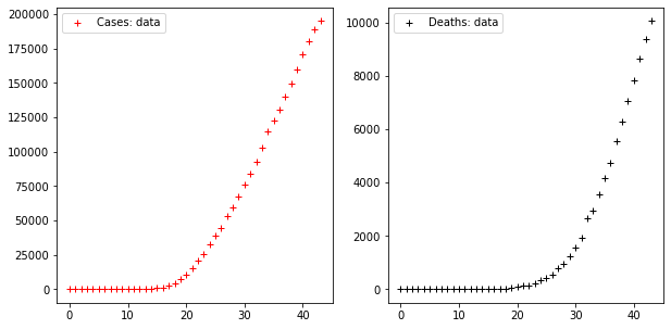
These two times series display a trend which, as far as the series of cases is concerned, starts increasing very rapidly from the 18th day on, showing that cases increased ten times in the ten days following that date.
How can we model such curves? Let us try some simple models at first, starting with the most popular options. Following a quick bout of Internet research it turns out that many people model population increments using two kinds of epidemic model, the exponential model and the logistic model. We will continue this pattern.
Parametric epidemic models: exponential and logistics
Exponential modelling
An exponential model is, to people familiar with a minimum of maths, just the exponential function with a couple of parameters plugged in to allow calibration. Thus we imagine a rule which given a time t produces a value C(t) for the cases at time t and D(t) for the deaths at time t, both being mathematical functions of the form:
C(t) = c1exp(c2t)
D(t) = d1exp(d2t)
where c1,c2 and d1,d2 are ‘model parameters‘. To calibrate the curve for the appropriated data series, we need to find out the value of the parameters which, substituted inside the functions, let them approximate the real data in the best possible way. Thus we have an optimization problem.
This is interesting since most artificial intelligence problems, and all machine learning problems are actually optimization problems! Thus, when calibrating a parametric model by fitting data, we are already engaged in machine learning to some degree; namely, we are learning the optimal parameters to fit the data. Instead of devising a method to calibrate parameters in a model, we can use one that has already been programmed. This is simple in Python and runs more or less as follows (the calibration function just minimizes the quadratic error since we are using the Euclidean norm):
from scipy.optimize import fmin

INTERVAL = np.arange(len(NY_DATA))    # t=0 means the first day; time increase is daily

def exponential(t, params):
    return params[0]*np.exp(params[1]*t)

def apply_model(model, init_cond, interval, data, disp =True, shadow=False, title=""):
    opt_params = fmin(lambda p: np.linalg.norm(model(interval, p) - data),
                      init_cond, disp = False)
    if disp:
        y = model(interval, opt_params)
        err = np.linalg.norm(y - data)
        print("Optimal parameters:", opt_params)
        print(f"Model error = {err:.2f}")
        plt.figure(figsize=(10, 5))
        if shadow:
            plt.fill_between(interval, [0 if x < 0 else x for x in y - err], y+err, facecolor="silver")
        plt.plot(interval, data, "r+", label="Cases: data")
        plt.plot(interval, y, "b", label=f"Cases: model")
        plt.title(title)
        plt.legend()
    return opt_params

apply_model(exponential, (CASES[0], 1), INTERVAL, CASES, title="Cases")
apply_model(exponential, (DEATHS[0], 1), INTERVAL, DEATHS, title="Deaths")Code language: PHP (php)
The output looks like this:
Optimal parameters: [3.98032285e+03 9.36244642e-02]
Model error = 77807.25
Optimal parameters: [7.91850070e-11 7.61280159e-01]
Model error = 16721.72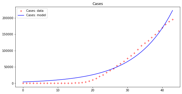
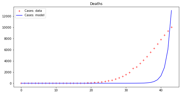
This result is bad (look at the errors – the first thing to examine when fitting data). However, as we have already pointed out, these data seem to display an exponential behavior only from the 18th day or so onwards. If we cut both time series by dropping the initial values we get a better picture:
apply_model(exponential, (CASES[17], 1), INTERVAL[17:], CASES[17:], title="Cases")
apply_model(exponential, (DEATHS[17], 1), INTERVAL[17:], DEATHS[17:], title="Deaths")Code language: JavaScript (javascript)
And the results are:
Optimal parameters: [4.94288955e+03 8.81173180e-02]
Model error = 64453.74
Optimal parameters: [32.08823952  0.13596649]
Model error = 2459.21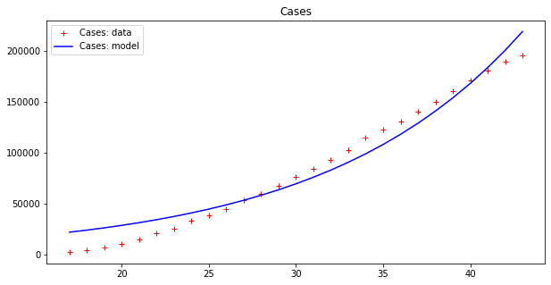
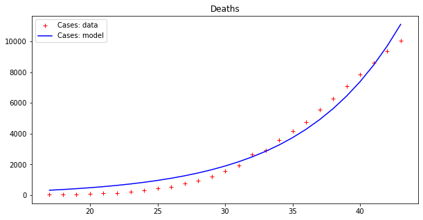
These results seems to display a much better fit, but is that really the case? By plotting a single line we are, in some sense, cheating, since our model fits data up to a point of error. It is better to plot this ‘error area’ as a strip around the curves, which makes the (low) effectiveness of the epidemic model clearer:
apply_model(exponential, (CASES[17], 1), INTERVAL[17:], CASES[17:], title="Cases", shadow=True)
apply_model(exponential, (DEATHS[17], 1), INTERVAL[17:], DEATHS[17:], title="Deaths", shadow=True)Code language: PHP (php)
Optimal parameters: [4.94288955e+03 8.81173180e-02]
Model error = 64453.74
Optimal parameters: [32.08823952 0.13596649]
Model error = 2459.21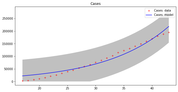
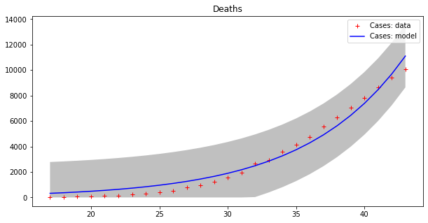
Now we can appreciate how coarse this modelling is!
Even worse though, this ‘model’ demonstrates a trend that makes no sense, since it keeps increasing exponentially forever. That would mean that both cases and deaths will continue to increase until they outnumber the total population of Earth!
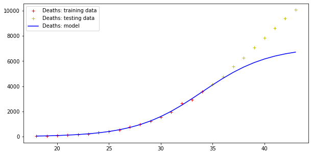
This ‘model‘ is just a bad fit for some points on a curve and not a meaningful predictive model. To see this more clearly, let us imagine splitting our data into a ‘training set‘ of 80% of all the data used to calibrate the epidemic model, and a ‘testing set’ formed of the remaining 20%, which we will use to test performance.
i0 = (len(INTERVAL) * 4) // 5
opt_param = apply_model(exponential, (CASES[17], 1), INTERVAL[17:i0], CASES[17:i0], disp=False)
y = exponential(INTERVAL[18:], opt_param)
print("Model error =", np.linalg.norm(y - CASES[18:]))

plt.figure(figsize=(10, 5))
plt.plot(INTERVAL[18:i0], CASES[18:i0], "r+", label="Cases: training data")
plt.plot(INTERVAL[i0:], CASES[i0:], "y+", label="Cases: testing data")
plt.plot(INTERVAL[18:], y, "b", label="Cases: model")
plt.legend()

opt_param = apply_model(exponential, (DEATHS[17], 1), INTERVAL[17:i0], DEATHS[17:i0], disp=False)
y = exponential(INTERVAL[18:], opt_param)
print("Model error =", np.linalg.norm(y - DEATHS[18:]))

plt.figure(figsize=(10, 5))
plt.plot(INTERVAL[18:i0], DEATHS[18:i0], "r+", label="Deaths: training data")
plt.plot(INTERVAL[i0:], DEATHS[i0:], "y+", label="Deaths: testing data")
plt.plot(INTERVAL[18:], y, "b", label="Deaths: model")
plt.legend()Code language: PHP (php)
The result is the following:
Model error = 352059.91670035594
Model error = 26296.154926583255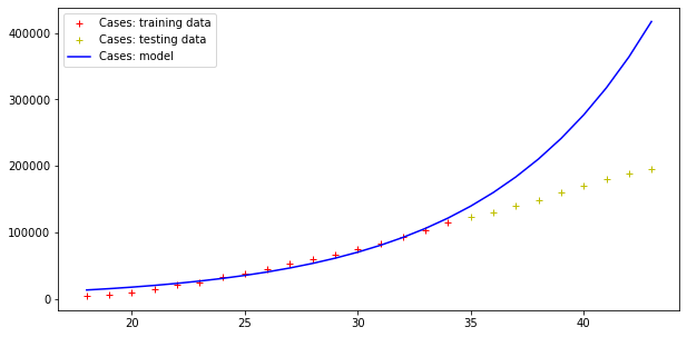
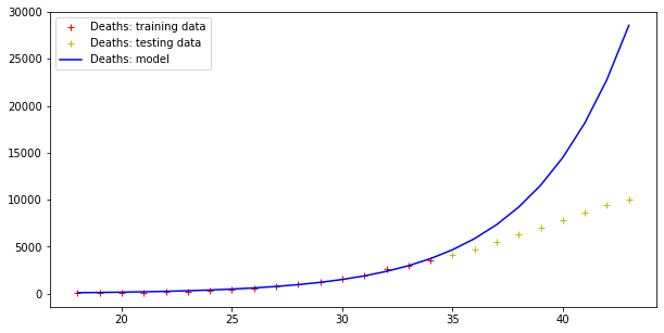
Therefore, this model fits data (badly) but fails totally at making predictions, as far the cases curve is concerned. On the other hand, testing data more or less fit this exponential curve. However, it doesn’t need a Nobel prize winner to understand that there is an upper boundary to the number of people in a population, and that the approach toward such a boundary is not exponential.
Let us explore that further with some maths, which is always needed at some point when dealing with models. We should use calculus, but let’s keep things simple – after all we are interested in points C0, C1,… along a curve, not the entire curve C(t). To recover the exponential curve we observe that, in order to produce a time series of exponential type, the next point in the curve is the current point Cn plus an increment proportional to Cn. The equation that expresses this is
Cn+1 − Cn = c2Cn
We can use this definition to compute points on the curve C: when using exponential models, this is unnecessary (we know the function!), but it generally applies to other models, for example the logistic model.
Logistic modelling
According to this model, growth in a part of a population follows the law:
Cn+1 – Cn = c2Cn(N−Cn)/N
with N being the total population. In this way Cn will not diverge as in the exponential series, but at a maximum will hit the N value (in which case the whole population is dead…). We can try to use this model to fit our data: more precisely we will model cases using the logistic model and deaths using the exponential model.
N = 1e5

def logistic(t, params):
    return params[0] /(1+np.exp(-params[1]*(t-params[2])))

apply_model(logistic, (2*CASES[-1], 1, (INTERVAL[-1]-INTERVAL[17])/2), INTERVAL[17:], CASES[17:], title="Cases", shadow=True)
apply_model(logistic, (2*DEATHS[-1], 1, (INTERVAL[-1]-INTERVAL[17])/2), INTERVAL[17:], DEATHS[17:], title="Deaths", shadow=True)Code language: PHP (php)
Here are the results:
Optimal parameters: [2.29810781e+05 1.83183796e-01 3.41548660e+01]
Model error = 18468.12
Optimal parameters: [1.31533912e+04 2.41333621e-01 3.82790444e+01]
Model error = 457.69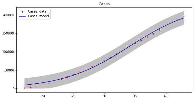
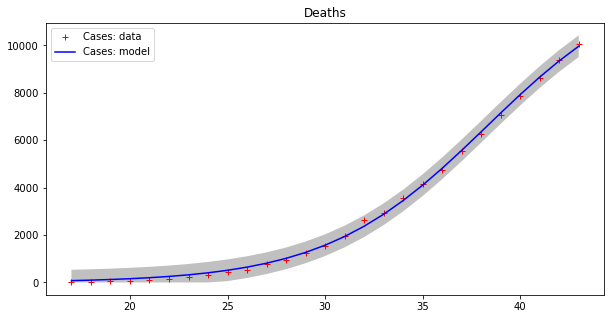
This model seems to fit the curve of cases better, even if errors are still high for cases, as the grey strips show. The curve of deaths seems to be accurately modeled in this way. Moreover, we have to guess the total population number, which is a kind of “hyper-parameter” for this model. Let us split the dataset into two parts as before, with the first 80% of values used as a training set and the remaining values as a testing set.
i0 = (len(INTERVAL) * 4) // 5
opt_param = apply_model(logistic, (2*CASES[-1], 1, (INTERVAL[-1]-INTERVAL[17])/2), INTERVAL[17:i0], CASES[17:i0], disp=False)
y = logistic(INTERVAL[18:], opt_param)
print("Model error =", np.linalg.norm(y - CASES[18:]))

plt.figure(figsize=(10, 5))
plt.plot(INTERVAL[18:i0], CASES[18:i0], "r+", label="Cases: training data")
plt.plot(INTERVAL[i0:], CASES[i0:], "y+", label="Cases: testing data")
plt.plot(INTERVAL[18:], y, "b", label="Cases: model")
plt.legend()

opt_param = apply_model(logistic, (2*DEATHS[-1], 1, (INTERVAL[-1]-INTERVAL[17])/2), INTERVAL[17:i0], DEATHS[17:i0], disp=False)
y = logistic(INTERVAL[18:], opt_param)
print("Model error =", np.linalg.norm(y - DEATHS[18:]))

plt.figure(figsize=(10, 5))
plt.plot(INTERVAL[18:i0], DEATHS[18:i0], "r+", label="Deaths: training data")
plt.plot(INTERVAL[i0:], DEATHS[i0:], "y+", label="Deaths: testing data")
plt.plot(INTERVAL[18:], y, "b", label="Deaths: model")
plt.legend()Code language: PHP (php)
And here are the results:
Model error = 92466.50981544874
Model error = 5404.289943307971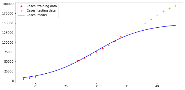
Errors are still very high, but the trend of actual cases seems to be qualitatively like the model curve (although the modelling of the deaths curve is clearly wrong!).
In fact, notwithstanding what can be read on the Web, these models are too simple to have any predictive value – people using them to model epidemic spreads are largely wasting their time.
To get more accurate models, one has to modify the increment appropriately for different curves. For example, the following two increment equations are inspired by the so-called SIR model (which is the simplest model used in epidemiology):
Cn+1 = Cn+c2Cn(N – Cn − Dn)/N − d2Cn
Dn+1 = Dn + d2Cn
In this way we take deaths into account and remove them from cases. The population is split into three parts: infected (I), dead (D) and all the rest (R), and the equations are not independent but related.
In a true SIR model we should model infected (I), dead(D) or healed people (R, for retired), and people susceptible to be infected (S), but these data are missing from our dataset (and are in any case usually very difficult to measure). The idea of SIR is that while the virus spreads, population S decreases, while both I and R increases: I attains a maximum and starts decreasing, while R keeps increasing.
There are more sophisticated epidemic models such as SEIR, MSEIR, etc. which divide the population into different parts and model the growth of the population in each part: these are the standard deterministic models of epidemiology. Nonetheless, the results of a simulation across 100 days of our new model follow.
import matplotlib.pyplot as plt
import numpy as np
from scipy.optimize import fmin

interval = range(len(NY_DATA))

CASES = np.array(NY_DATA.loc[:, "cases"])
DEATHS = np.array(NY_DATA.loc[:, "deaths"])

N = 0.5e6

def IDR(t, c1, c2, d1, d2):
    if not isinstance(t, float) and not isinstance(t, int):
        return np.array([IDR(i, c1, c2, d1, d2) for i in t])
    if t == 0:
        return np.array([c1, d1])
    ft_1 = IDR(t-1, c1, c2, d1, d2)
    ct_1 = ft_1[0]
    dt_1 = ft_1[1]
    return np.array([ct_1 + c2*ct_1*(N - ct_1 - dt_1)/N - d2*ct_1, dt_1+d2*ct_1])

def calibration(interval, C, D):
    CD = np.array([[C[i], D[i]] for i in range(len(C))])
    return fmin(lambda params: np.linalg.norm(IDR(interval, params[0], params[1], params[2], params[3]) - CD), (C[0],1,D[0],1), disp = False)

big_interval = range(100)
c1, c2, d1, d2 = calibration(interval, CASES, DEATHS)
fit = IDR(big_interval, c1, c2, d1, d2)

fig, axes = plt.subplots(1, 2, figsize=(10, 5), sharey='all')
axes[0].plot(interval, CASES, "r+", label="Cases: data")
axes[0].plot(big_interval, fit[:,0], "b", label=f"Cases: C(t)")
axes[0].legend()
axes[1].plot(interval, DEATHS, "r+", label="Deaths: data")
axes[1].plot(big_interval, fit[:,1], "b", label=f"Deaths: D(t)")
axes[1].legend()

print("Error for D(t) =", np.linalg.norm(fit[:len(interval),0] - CASES))
print("Error for D(t) =", np.linalg.norm(fit[:len(interval),1] - DEATHS))Code language: PHP (php)
The output is:
Error for D(t) = 55277.27002540128
Error for D(t) = 6128.543579522949Code language: JavaScript (javascript)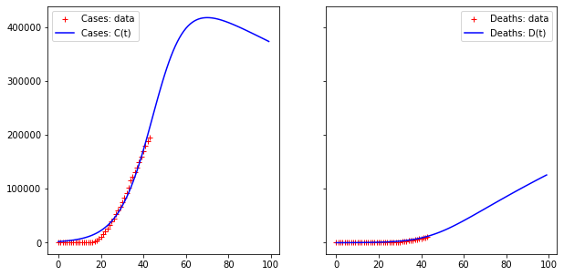
Let us split the data set in two series as before, using the first half as a training set and the second half as a testing set.
fig, axes = plt.subplots(1, 2, figsize=(10, 5))

training_interval = interval[:len(interval)*4//5]
testing_first = len(training_interval)

# Calibrate parameters for modelling the cases
training_cases = CASES[:len(interval)*4//5]
training_deaths = DEATHS[:len(interval)*4//5]
c1, c2, d1, d2 = calibration(training_interval, training_cases, training_deaths)
fit = IDR(interval, c1, c2, d1, d2)
axes[0].plot(training_interval, training_cases, "r+", label="Cases: training data")
axes[0].plot(interval[testing_first:], CASES[testing_first:], "y+", label="Cases: testing data")
axes[0].plot(interval, fit[:,0], "b", label="Cases: model C(t)")
axes[0].legend()

# Calibrate parameters for modelling the cases
axes[1].plot(training_interval, training_deaths, "r+", label="Deaths: training data")
axes[1].plot(interval[testing_first:], DEATHS[testing_first:], "y+", label="Deaths: testing data")
axes[1].plot(interval, fit[:,1], "b", label="Deaths: model D(t)")
axes[1].legend()

print("Error for C(t) =", np.linalg.norm(fit[:,0] - CASES))
print("Error for D(t) =", np.linalg.norm(fit[:,1] - DEATHS))Code language: PHP (php)
Again, the result is definitely not satisfactory…
Error for C(t) = 184506.22085618484
Error for D(t) = 2511.425471089619Code language: JavaScript (javascript)
As we see, the logistic model overestimates the increase of the cases curve, but more or less predicts the trend of the deaths curve.
Remarks on epidemic model parameters learning
We didn’t succeed in finding a model to predict our data, but we learned some useful lessons:
- Simple models may fit available data but are not reliable ways to predict anything
- Models are often chosen according to the available data: we did this and we failed. Honestly, New York Times data are not suitable for any interesting analysis, and we would be better to look for more complete data, i.e., including the number of healed people, etc.
- To train a “parametric model” is easy and is a simple form of machine learning: the difference with more advanced techniques is that here we pretend that the model follows a deterministic rule (the function we used to fit it: exponential, logistic, our toy model or a more realistic function as SIR, SEIR, etc.)
- Models that are not randomly chosen but are instead built relying upon epidemiological knowledge should be privileged, but finding the data needed to feed them may be challenging
Actual machine learning models do not pretend to shape data inside a deterministic curve: instead, they create a black-box model which, when given input simply provides output. Neural networks are like that and we will touch on some points about these in a subsequent article about how to apply them to model our data.