From the beginning of the World Wide Web, we have witnessed an increasing number of solutions for presenting websites to end users. Conversely, nowadays web designers tend to adopt practically the same layout template for most of the modern websites. As said by Jen Simmons, Designer Advocate at Mozilla, “we are not designing layouts; we are downloading them”.
During Codemotion Milan 2018, Giulia Talamonti, front-end developer at Credimi, discussed the evolution of modern web layouts and tried to step into Gutenberg’s shoes: how would Gutenberg have designed web templates? In particular, since his interests were in editorial printing, which choices would have him taken in order to develop an editorial web layout?
In this post, we will summarize Giulia’s ideas and discuss which solutions may allow to develop a modern editorial web layout.
The evolution of web layouts
Looking back to the past, the first websites had no layouts at all, and were only aimed at showing plain or poorly enriched text. Therefore, in the 90s web developers and designers started using tables, and the first “standard” web layouts began to emerge.
More recently, web designers started using better and CSS-only solutions. Grid layouts have significantly changed the way designers build layouts, offering a more flexible way to arrange elements inside a web page.
Today, we entered in the mobile era, and new needs emerged for modern websites. Screens form factors are no more uniform, landscape and portrait modes should be interchangeably usable and websites must provide an equally excellent user experience in desktop computers, laptops and mobile devices. These emerging needs drove new trends towards responsive web design.
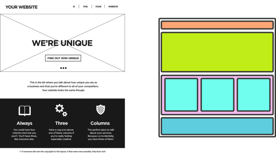
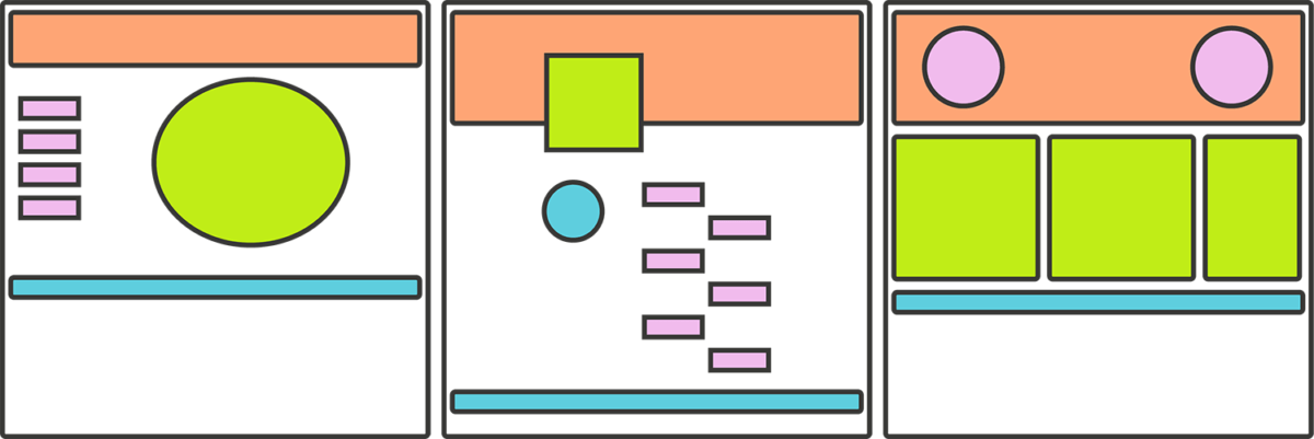
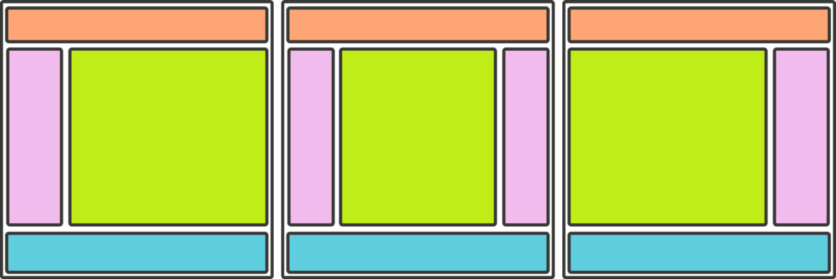
Today we are still in the mobile era, but what web designers are usually doing is to adopt a sort of layout template which is very similar for most websites. According to Giulia Talamonti, we have a sort of “layout of the present”, which is depicted in the following images:
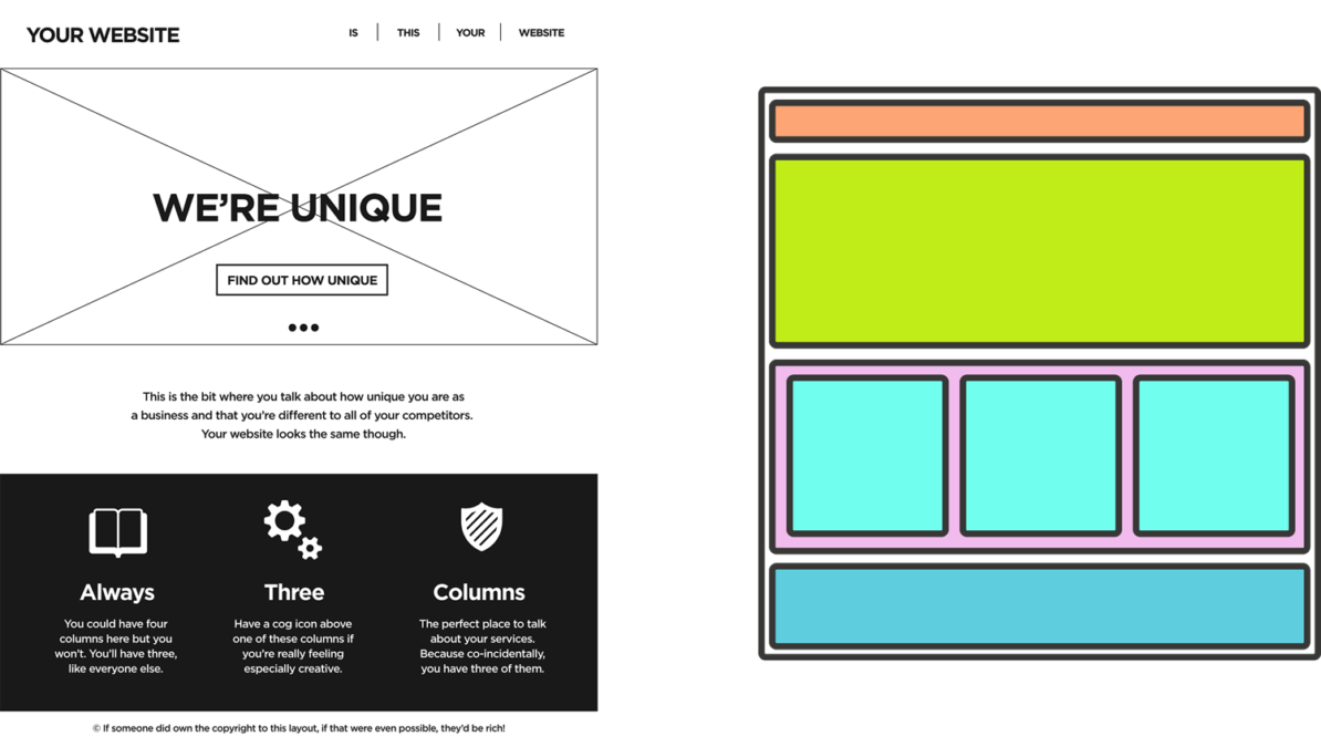
Using any CMS like WordPress, Drupal or Joomla, you can quickly figure out that all the available templates are based on this sort of “standard” layout.
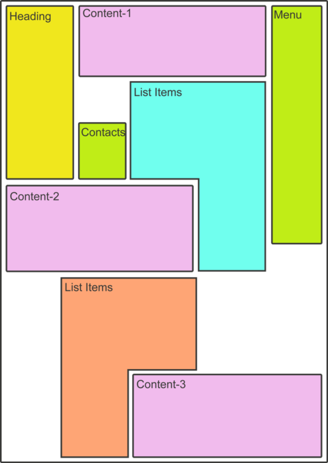
However, there are situations where such a layout might be replaced by something different. Several newspaper websites are using something that is completely different from the printed version. Arranging content similarly in both the printed and the digital version of a newspaper may help the end users in finding more easily the location of an article or an image when using both the formats.
According to Giulia Talamonti, Gutenberg would probably have opted for such an idea. So, how can we use the CSS grid in order to develop an editorial web layout?
Designing editorial web layouts
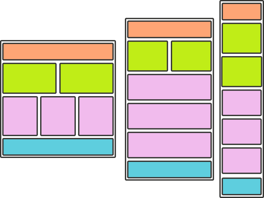
A modern editorial web layout can have a structure similar to the following one:
In order to implement this, Giulia Talamonti identified some key features and issues that should be considered in the development of such a layout.
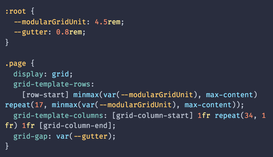
Modular grids. Arranging elements with the above layout can be easily done by using the CSS grid, and in particular using modular grids. This approach has many advantages: it helps to align elements, makes navigation easier, and allows us to create an adaptive website (thus supporting the responsive requirement)
Adaptive contents. Many CSS tricks can be used in order to automatically adapt the content (i.e. the texts) to the container elements. However, they are often replaced with JavaScript because of their rare application in actual designs. It is the case of minmax(), fit-content() and max-content/min-content, which allows us to create adaptive solutions:
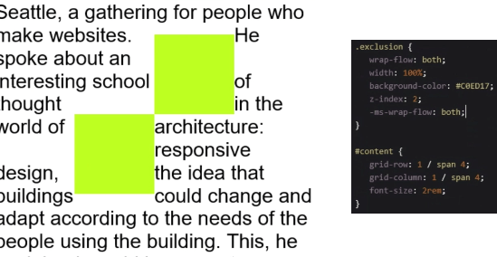
Grid and float. Float elements may be painful to incorporate inside a grid layout. This is the case, for instance, when we want a floating element (e.g. an image) with text on both sides of it. The CSS exclusion module can help in this direction, allowing the use of wrap-flow: both. However, it is currently supported by Internet Explorer 10+ only, and usually this is solved with additional JavaScript
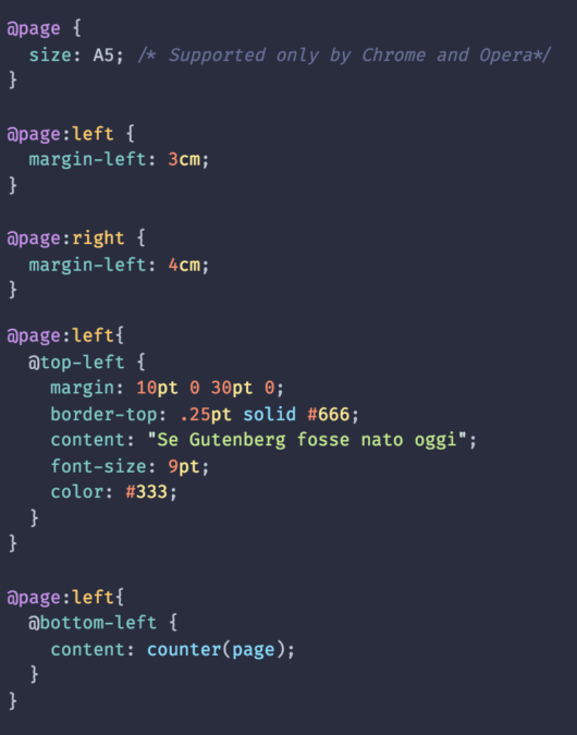
Printing stylesheets. If we want to design an editorial layout, properly printing a page based on such a layout is a crucial feature. This needs to be addressed by means of the @page media rule. Indeed, it allows to specify the page format (e.g. A4 or A5, but this is only supported by Chrome and Opera), as well as page margins or page numbering.
Note also that browsers like Chrome incorporate testing features in their debuggers, which allow rendering the output of a printed page (without actually printing anything).
As a final note, consider that eBooks are nothing but webpages. The ideas described above about designing an editorial layout may thus find interesting application in the context of eBooks design.