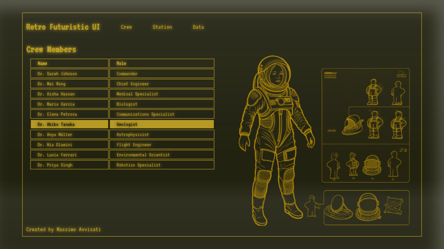
Do you also find yourself paying more attention to futuristic terminals and displays in sci-fi movies and series than to their plots? Personally, I have a genuine passion for this ancient art of imagining and designing the UX/UI of the future. And I don’t think I’m the only one 🤓
In this tutorial, we will draw inspiration from the Fallout UI with the retro-futuristic style of the Pip-Boy 3000 to delve into some modern and little-known CSS techniques that can transform a web page into a true experience or a perfect sci-fi display contained in a 3D-printed prop… and without forgetting accessibility!
Creating a Semantic HTML Base
To start, let’s create some dummy content using semantic HTML tags. Here’s a basic HTML example that we will use for our Fallout UI:
<!DOCTYPE html>
<html lang="en">
<head>
    <meta charset="UTF-8">
    <meta name="viewport" content="width=device-width, initial-scale=1.0, maximum-scale=1.0, user-scalable=no">
    <title>Retro Futuristic UI</title>
    <link rel="stylesheet" href="style.css">
</head>
<body>
    <div class="retro-container scanline-effect">
        <header>
            <h1></h1>
            <nav role="navigation">
                <ul>
                    <li><a href="#screen-1">SCREEN 1</a></li>
                </ul>
            </nav>
        </header>
        <main>
            <section id="screen-1">
                <article>
                    <header>
                        <h2>SCREEN 1</h2>
                    </header>
                    <div class="content">
                        Lorem ipsum...
                    </div>
                    <figure>
                        <img src="url_illustration" alt="alt text for illustration">
                    </figure>
                </article>
            </section>
        </main>
        <footer>
            <p></p>
        </footer>
    </div>
</body>
</html>
Code language: HTML, XML (xml)
This HTML code creates a semantic base structure with a header, a main section divided into sections, and a footer. Navigation between sections is achieved through links in the menu contained in the nav tag, explicitly declaring its role (thus instructing screen readers or other assistive technologies).
Maintaining Responsiveness and Accessibility
We must remember that by default, a well-structured HTML page without styles is already responsive and accessible: the modifications we make with CSS introduce new potential issues, so it’s important to follow the principle of less is more and proceed step by step.
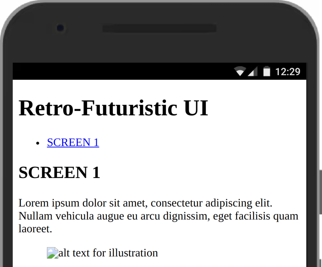
For our interface, we will use a responsive structure with a central area that serves as a container for sections containing article elements: even within these, it’s important to implement semantics and accessibility.
In short, our base without CSS must (as always) be an example of rectitude and love for web standards, ideally obtaining all maximum scores when using tools like Google Lighthouse to evaluate accessibility and best practices. 🫶
See the results of creating a Pip-Boy-like UI in the video below!
Typography and Colors
When we have our basic content, we can have fun finding an initial aesthetic base!
Let’s choose a terminal-style font and add it to our HTML page:
html<code><link rel="preconnect" href="https://fonts.googleapis.com">
<link rel="preconnect" href="https://fonts.gstatic.com" crossorigin>
<link href="https://fonts.googleapis.com/css2?family=VT323&display=swap" rel="stylesheet">
</code>Code language: HTML, XML (xml)
To create the retro-futuristic Fallout-style atmosphere, we will use a monospace font and a specific color palette. Let’s start by defining CSS variables for colors and font:
:root {
    font-family: "VT323", monospace;
    font-weight: 400;
    --primary-color: #ffd52c;
    --secondary-color: #ff5c00;
    --tertiary-color: #c72d04;
    --background-color: #111;
    scrollbar-color: var(--primary-color) var(--secondary-color);
    font-size: clamp(18px, 3vw, 30px);
}Code language: CSS (css)
Using variables is important for making style changes or variants later!
Let’s apply these basic styles to our document:
* {
    margin: 0;
    padding: 0;
    box-sizing: border-box;
}

body {
    display: flex;
    justify-content: center;
    align-items: center;
    height: 100vh;
    background-color: var(--background-color);
    cursor: url('./assets/mouse.svg')
Code language: CSS (css)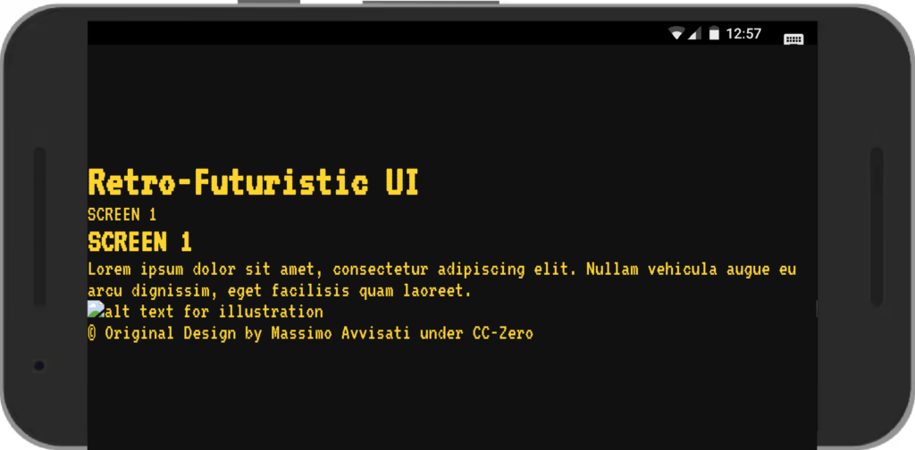
We have also added a more styled cursor in SVG format, ensuring it does not exceed 32px (beyond which it might not be recognized by the browser).
Responsive Layout
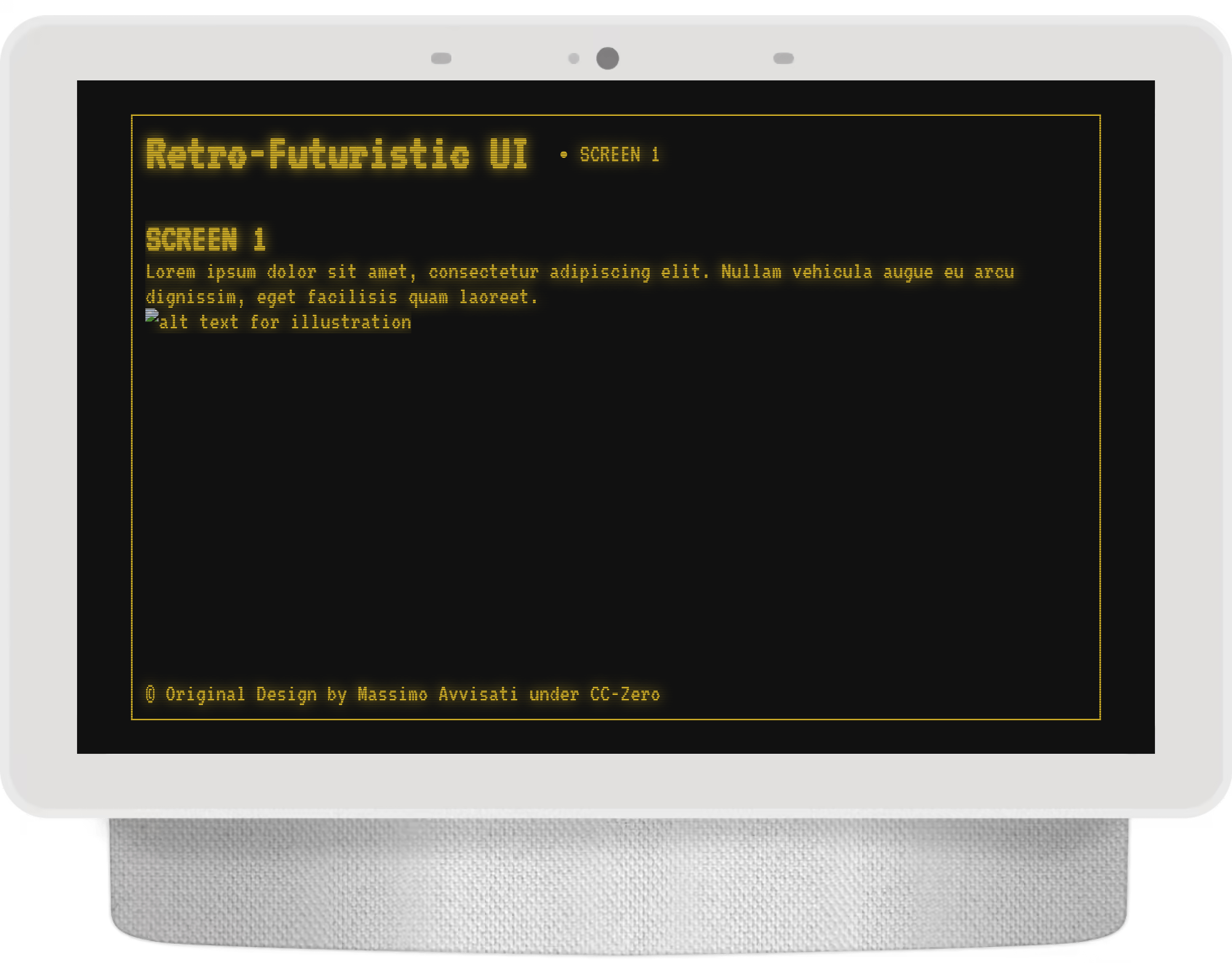
Let’s create a responsive layout with a header, main, and footer within a container that occupies the entire display and is centered.
Header and footer will always be present, while the main content will be organized into sections controlled by the navigation menu.
div.retro-container {
    width: 90vw;
    height: 90vh;
    display: grid;
    grid-template-rows: auto 1fr auto;
    overflow: hidden;
    padding: 0.5rem;
    border: 2px solid var(--primary-color);
    color: var(--primary-color);
    mask-image: linear-gradient(to bottom, #0005 50%, #000 50%);
    mask-size: 100% 2px;
    text-shadow: 0 0 0.5rem;
}

header,
footer {
    display: flex;
    gap: 2rem;
    align-items: center;
}

main {
    overflow: hidden;
}

section {
    height: 100%;
    overflow: hidden auto;
    margin: 1rem 0;
}
Code language: CSS (css)
The sections will be our screens, and it will only be possible to move from one section to another through the navigation menu.
We can also add a script at the end of the page to always scroll to the top of each section’s content when clicking on menu links:
document.querySelectorAll('a[href^="#"]').forEach(anchor => {
    anchor.addEventListener('click', function (e) {
        e.preventDefault();
        const targetId = this.getAttribute('href');
        const targetElement = document.querySelector(targetId);
        const main = document.querySelector('main');

        if (targetElement) {
            main.scrollTo({
                top: targetElement.offsetTop - main.offsetTop,
                behavior: 'smooth'
            });
        }
    });
});
Code language: JavaScript (javascript)
Visual Effects and Animations
To achieve a retro-futuristic look, let’s add some visual effects and animations.
Old CRT Monitor Effect

Let’s create a CRT effect with an animation to mimic the “horizontal band” typical of cathode ray tubes (due to low refresh rates) using an animated linear gradient background-position: we can play with speed, angle, and even the gradient to achieve our preferred flickering effect!
Add a backlight-like gradient on the edges using a box-shadow with the inset value: note that not specifying colors in instructions like this will inherit the color property from the containing element (or the first ancestor element that specifies it).
@keyframes crtAnimation {
    0% {
        background-position: 0 0;
    }

    100% {
        background-position: 0 10000%;
    }
}

.old-crt-monitor {
    box-shadow: inset 0px 0px 2rem;
    background-image: linear-gradient(0deg, #0000 10%, #fff1 90%, #0000 100%);
    animation: crtAnimation 100s linear infinite;
    background-size: 100% 80%;
}
Code language: CSS (css)
Scanline Effect
To reproduce the lo-fi terminal lines, we can create a scanline effect on the main container using mask-image:
div.retro-container {
    mask-image: linear-gradient(to bottom, #0005 50%, #000 50%);
    mask-size: 100% 2px;
}
The gradient that generates mask-image is repeated every 2px, creating a slightly transparent one-pixel line and a completely unaltered line: playing with these parameters can produce very interesting patterns!
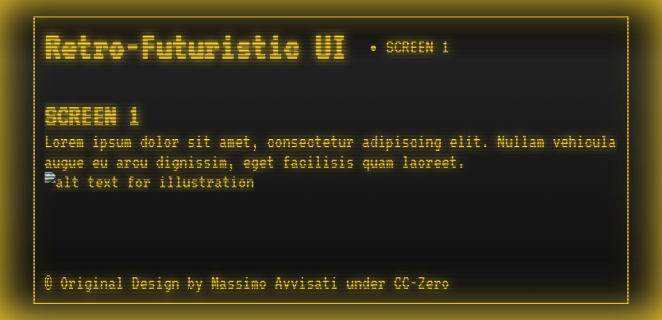
The surprising thing is that the mask even applies to the scrollbar, ensuring a more consistent experience with minimal effort!
Red Alert
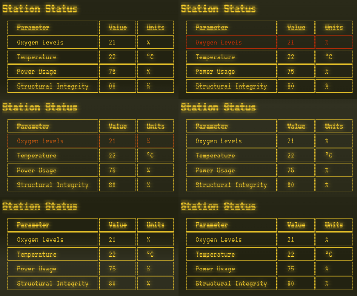
No sci-fi display is complete without a flashing element to draw our attention to an imminent catastrophic plot twist.
Let’s create an animation for alert elements:
<code>alert {
    animation: blink-bg 1s ease-out infinite;
}

@keyframes blink-bg {
    0%, 60% {
        text-shadow: 0 0 10.5rem;
        color: var(--primary-color);
    }
    70%, 100% {
        text-shadow: 0 0 20.5rem;
        color: var(--tertiary-color);
    }
}
</code>Code language: HTML, XML (xml)
Using Generative AI to Create Sci-Fi Content
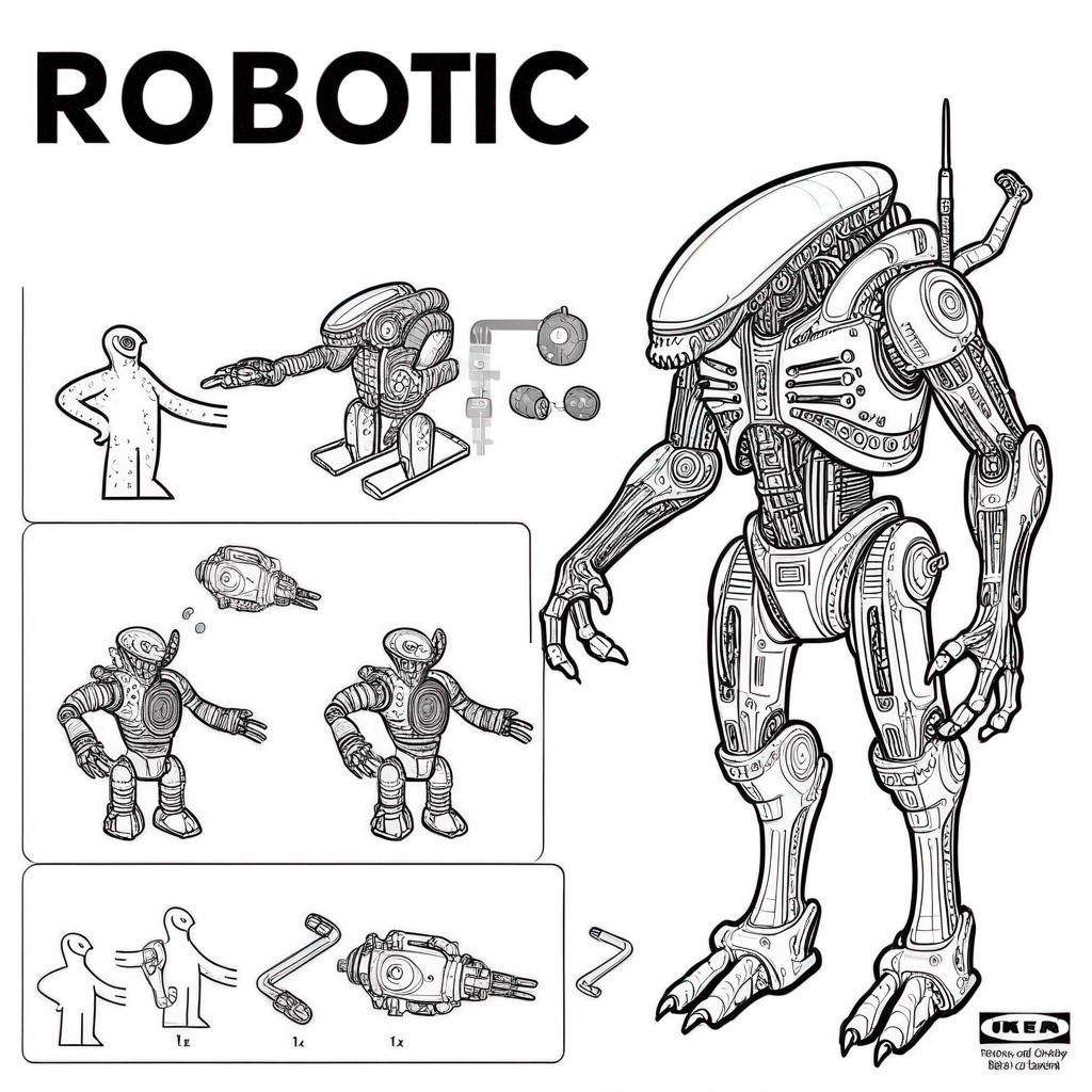
Using AI models to generate fictitious content directly in HTML (as I did in the final version) can help us step out of our comfort zone and explore new design ideas, providing a result far better than the classic lorem ipsum.
The fantastic technical drawings were generated with the fun IKEA instruction generator model (LORA SDXL) trained by Ostris.
Recommended article: CSS Revival in 2024 and Other frontend trends
Create Your Pip-Boy 3000 With CSS: Conclusions
Experimenting with CSS to create retro-futuristic Fallout-style designs is fun and useful. We should not underestimate the potential of creativity, but it is important to always follow best practices and accessibility rules. Indirectly, these guidelines will also facilitate artistic work.

