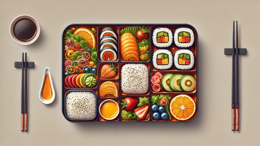
A Bento box (🍱) is a traditional Japanese lunchbox that neatly and separately organizes various prepared dishes. Bringing a ready-made bento to school is a gesture of affection toward the recipient. The care in organizing and presenting the dishes—besides the quality of the food—represents how much the person means to you.
Inspired by this practice and this object’s minimalist, balanced, and functional design, a trend in UX/UI design has emerged called the Bento Layout (or Bento Box Layout). This tutorial focuses on this design approach: instead of rice, carrots, or octopus-shaped sausages, we’ll use modern HTML and CSS as our ingredients, combined with the same level of care and affection.

Bento Box With CSS: The Basics
For our experiment, we’ll start with a simple but very common base structure: a main element containing several section elements. Each section contains multiple article elements, each with its header and an image wrapped in a semantic figure element:
<!DOCTYPE html>
<html lang="en">
  <head>
    <link rel="stylesheet" type="text/css" href="style.css">
    <meta charset="utf-8" />
    <title>🍱 Bento Box Design Layout with Modern CSS</title>
  </head>
  <body>
    <main>
      <section class="bento">
        <article>
          <header>
            <h2>Box 1</h2>
            <p>Lorem ipsum dolor, sit amet consectetur adipisicing elit.</p>
          </header>
          <figure>
            <img src="./images/0.png" alt="AI-generated anime picture">
          </figure>
        </article>
        <!-- 7 more articles here -->
      </section>
    </main>
  </body>
</html>
Code language: HTML, XML (xml)
We’ll use modern CSS (Baseline) to make our base responsive with a mobile-first approach:
:root {
    font-family: system-ui, sans-serif;
    font-size: clamp(14px, 5vw, 20px);
    --dark-color: #5c6378ff;
    --light-color: #edf2f4ff;
    --background-color: #2b2d42ff;
    --secondary-color: #757e93ff;
    --antiflash-white: #edf2f4ff;
    --important-color: #ef233cff;
    --fire-engine-red: #d90429ff;
}

body {
    background-color: var(--background-color);
    color: var(--light-color);
    margin: 0;
}

article {
    background-color: var(--light-color);
    color: var(--dark-color);
    padding: 1rem;
    margin-bottom: 1rem;
}

article figure {
    margin: 0;
}

img {
    display: block;
    width: 100%;
}

main {
    width: 90%;
    max-width: 1200px;
    margin-inline: auto;
    padding-block-start: 2rem;
}
Code language: CSS (css)
With a few changes to the stylesheet, our HTML elements are accessible and perfectly usable by default: less is more in CSS 🍣.
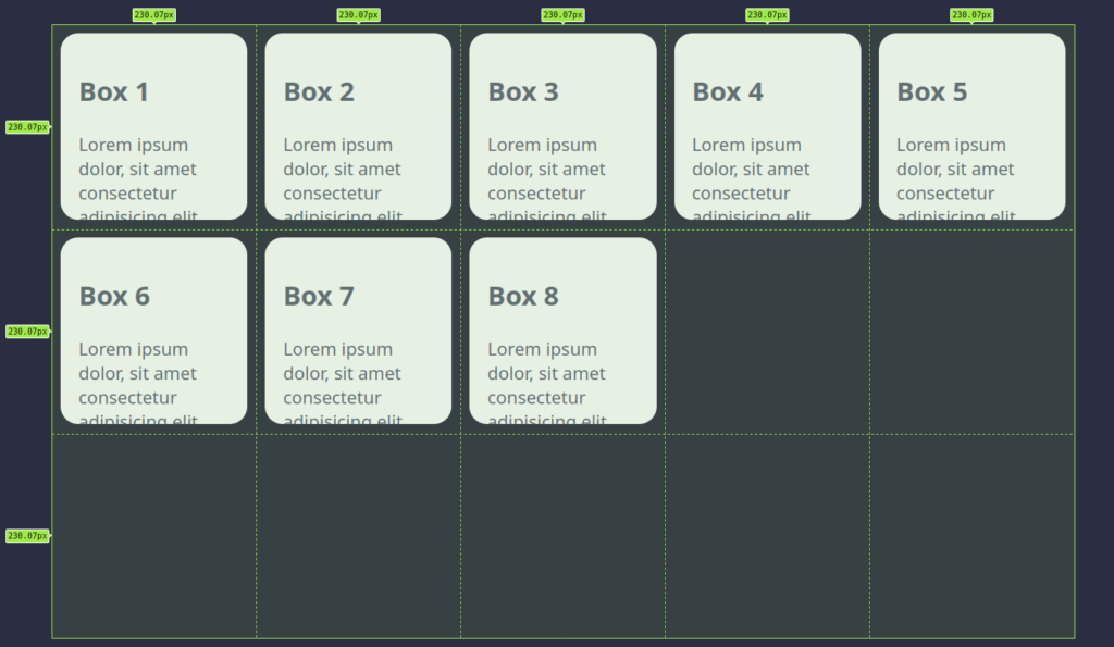
Bento with Grid Layout
For a modular layout composed of containers, we’ll set the display property of our section elements to grid. To customize the position and shape of the articles, we’ll add some extra settings for flexibility.
.bento {
    --bento-cols: 5;
    --bento-rows: 3;
    --bento-border-radius: 1rem;
    --bento-gap: 1rem;
    display: grid;
    grid-template-columns: repeat(var(--bento-cols), 1fr);
    grid-template-rows: repeat(var(--bento-rows), 1fr);
    width: 100%;
    aspect-ratio: var(--bento-cols) / var(--bento-rows);
}

.bento > * {
    overflow: hidden;
    position: relative;
    margin: calc(var(--bento-gap) / 2);
    border-radius: var(--bento-border-radius);
}

@media screen and (aspect-ratio < 1) {
    .bento {
        --bento-cols: 3;
        --bento-rows: 5;
    }
}
Code language: CSS (css)
We’ve introduced variables to control the number of columns and rows, dividing the “bento grid” into equal fractions. Using the aspect-ratio property ensures the cells are perfectly square, which is the key to our strategy.
Customize Your Bento Design
Let’s personalize the bento box by specifying how many cells each element spans. Using the span value in grid-column or grid-row properties, we can create horizontal (2×1 cells), vertical (1×2 cells), and large square (2×2 cells) modules.
Here’s how to define a reusable template with a layout-1 class:
.bento.layout-1 > :nth-child(1) {
    grid-column: span 2;
    grid-row: span 2;
    background-color: var(--important-color);
    color: var(--light-color);
}

.bento.layout-1 > :nth-child(2) {
    grid-row: span 2;
    background-color: var(--secondary-color);
    color: var(--light-color);
}

.bento.layout-1 > :nth-child(n + 9) {
    display: none;
}
Code language: CSS (css)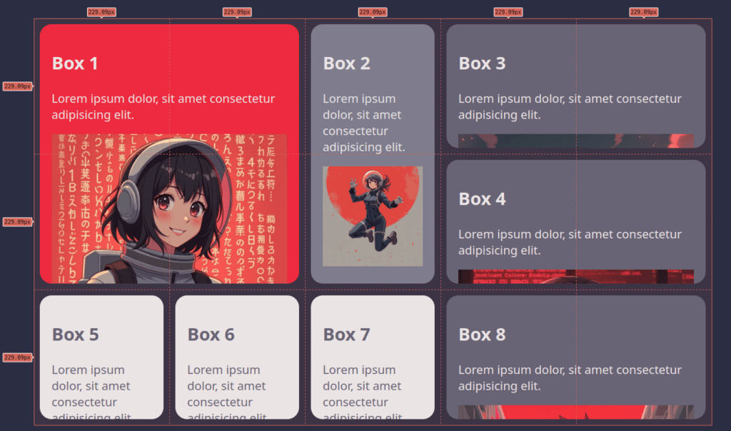
Micro-Animations
Add subtle micro-animations to enhance the interface:
.bento > * {
    transition: transform 0.3s ease-out, filter 0.3s ease-out;
}

.bento > *:hover {
    transform: translateY(-0.5rem);
    filter: drop-shadow(0 0.5rem 0.1rem #0009);
}
Code language: CSS (css)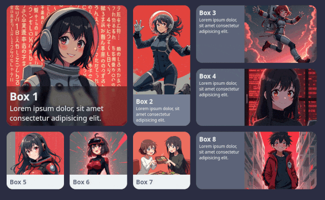
Conclusion
This tutorial explored how to create a modern Bento Box Layout using CSS. We achieved a flexible, responsive, visually appealing design by combining grid layout, aspect ratio, container queries, and micro-animations. This approach is as versatile as a real bento box, allowing endless combinations while maintaining order and balance.
Experiment with these ideas to find the perfect recipe for your special bento! Bon appétit!


